
One of the most important things to keep in mind is color balance. For anything you edit/make in Photoshop, the color choices should be eye-catching and easy on the eyes at the same time. Not too dull, not too bright (unless you're going for a certain style). Not too much of one color, not too much of another color.
What I highly suggest for you to try first are the adjustments found by clicking on the half-white-half-black circle at the bottom of the Layers box.
What I highly suggest for you to try first are the adjustments found by clicking on the half-white-half-black circle at the bottom of the Layers box.
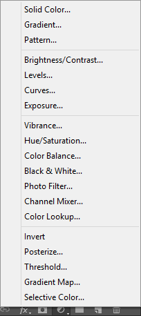
If used correctly, whatever image you're working on will have a beautiful color palette! Here are some tips on some of the adjustments:
- Gradient Map & Gradient: don't confuse these two. Gradient maps use gradients to change the colors of an image to the colors of the gradient, while a gradient is just a soft blend of at least 2 colors.
- Pattern: It's alright to use other images to improve color balance! In fact, you can use them to add simple effects. I suggest trying nebula patterns because they go with almost everything.
- Brightness/Contrast: It's usually best to increase both the brightness and contrast, or decrease the brightness and increase the contrast.
- Photo Filter: This is very useful when it comes to balancing colors. You can use any color, and a mask will be created to kind of make everything a shade closer to whatever color you chose.
- Color Balance: It speaks for itself. It's extremely highly suggested to use this.
- Selective Color: It's similar to the Color Balance, except it focuses on specific colors individually.
